- Help
- Forms
Creating Forms
In this guide, you will learn
- How to create forms
- How to add, remove, and customize form elements
Creating Forms
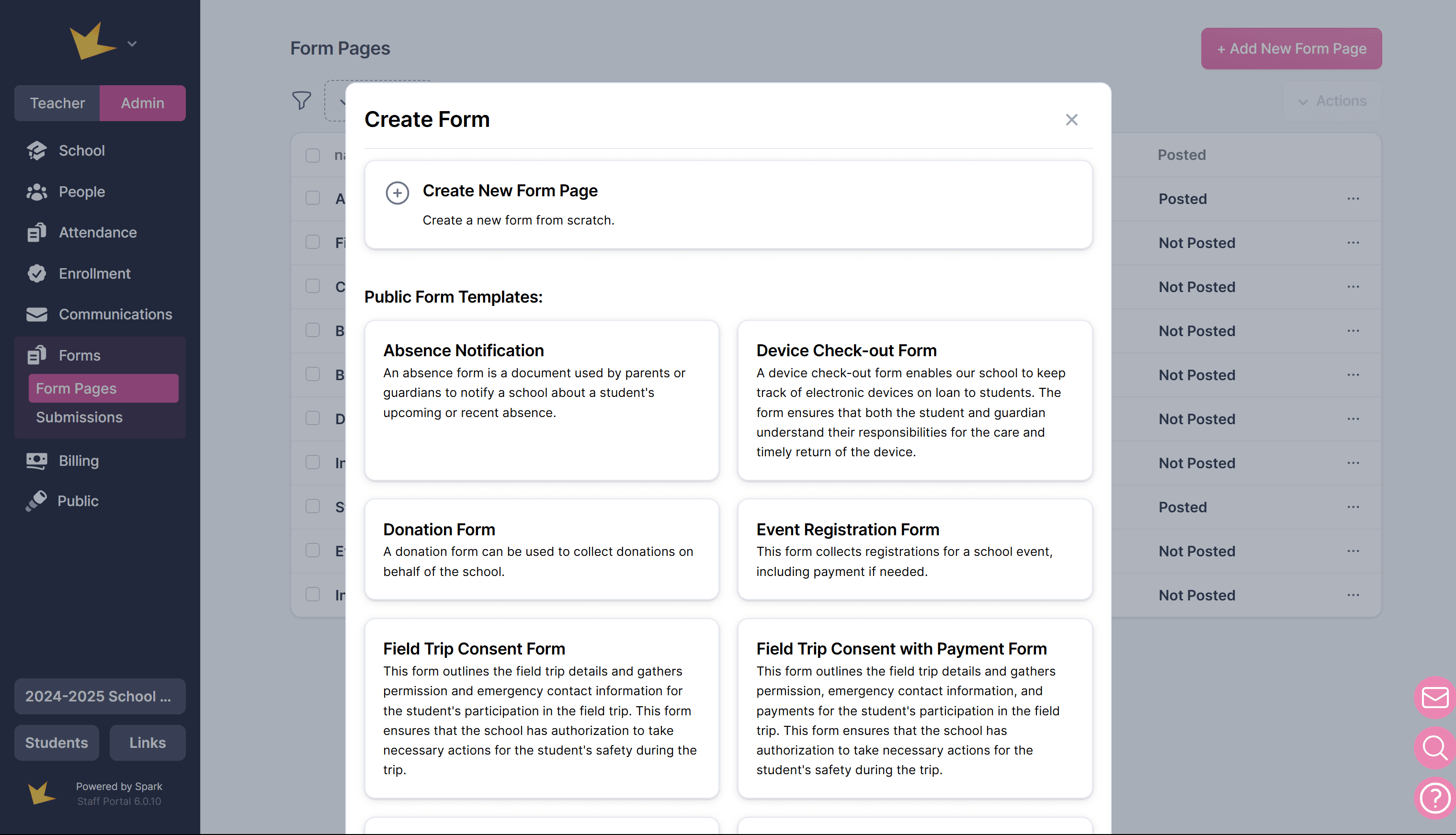
- Go to Admin → Forms → Form Pages.
- Click + Add New Form.
- Choose to either:
- Create a New Blank Form: Enter form details and click Create.
- Use a Form Template: Preview and select a template, then customize it by adding, removing, or modifying elements as needed.
- Add, remove, and customize form elements as needed. See information below to learn more about form elements.
Note: These instructions apply to Form Pages in the main Form feature. Custom Forms use the same elements (excluding payment and signature inputs), so most of this information is also relevant when building a Custom Form.
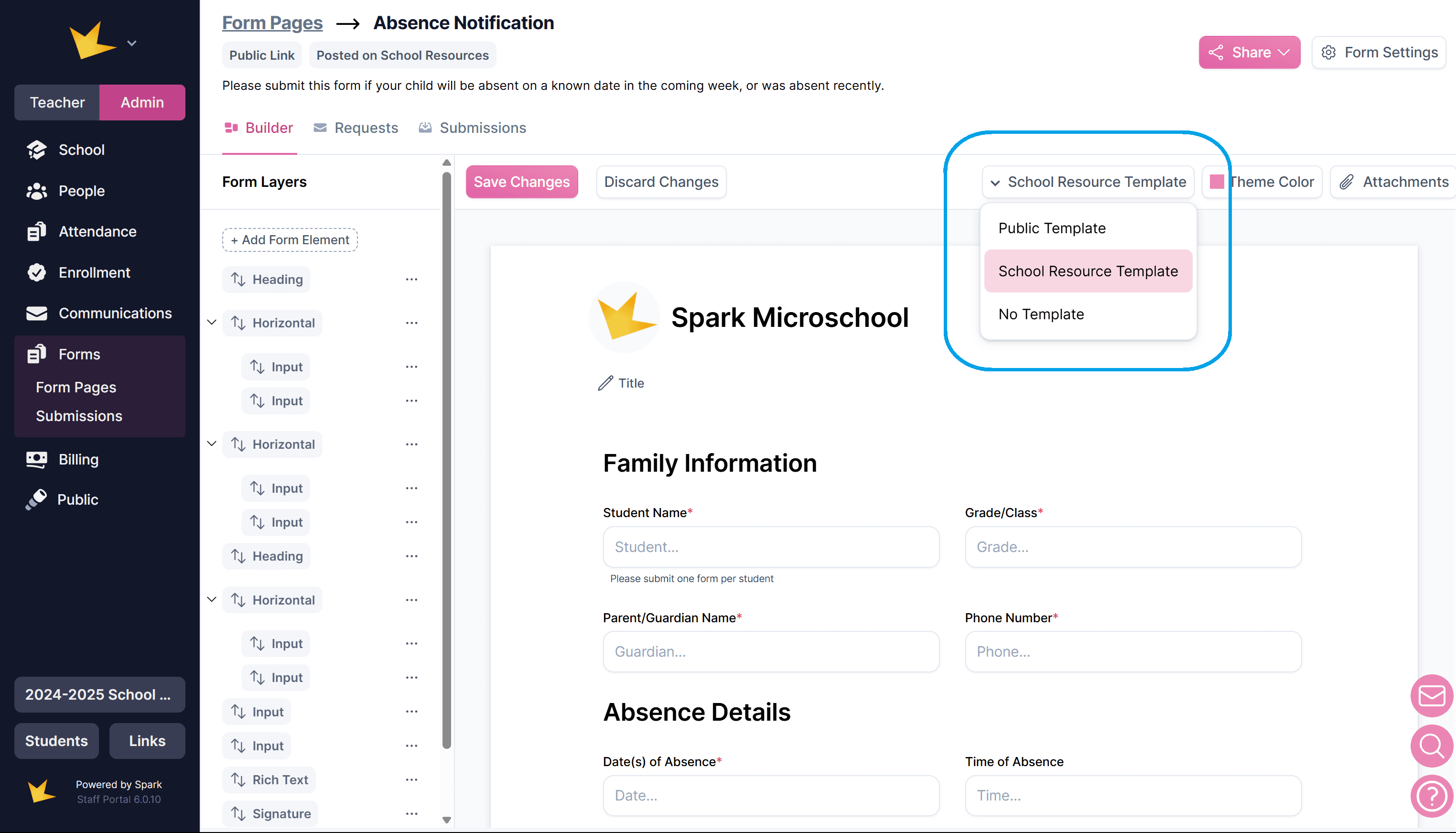
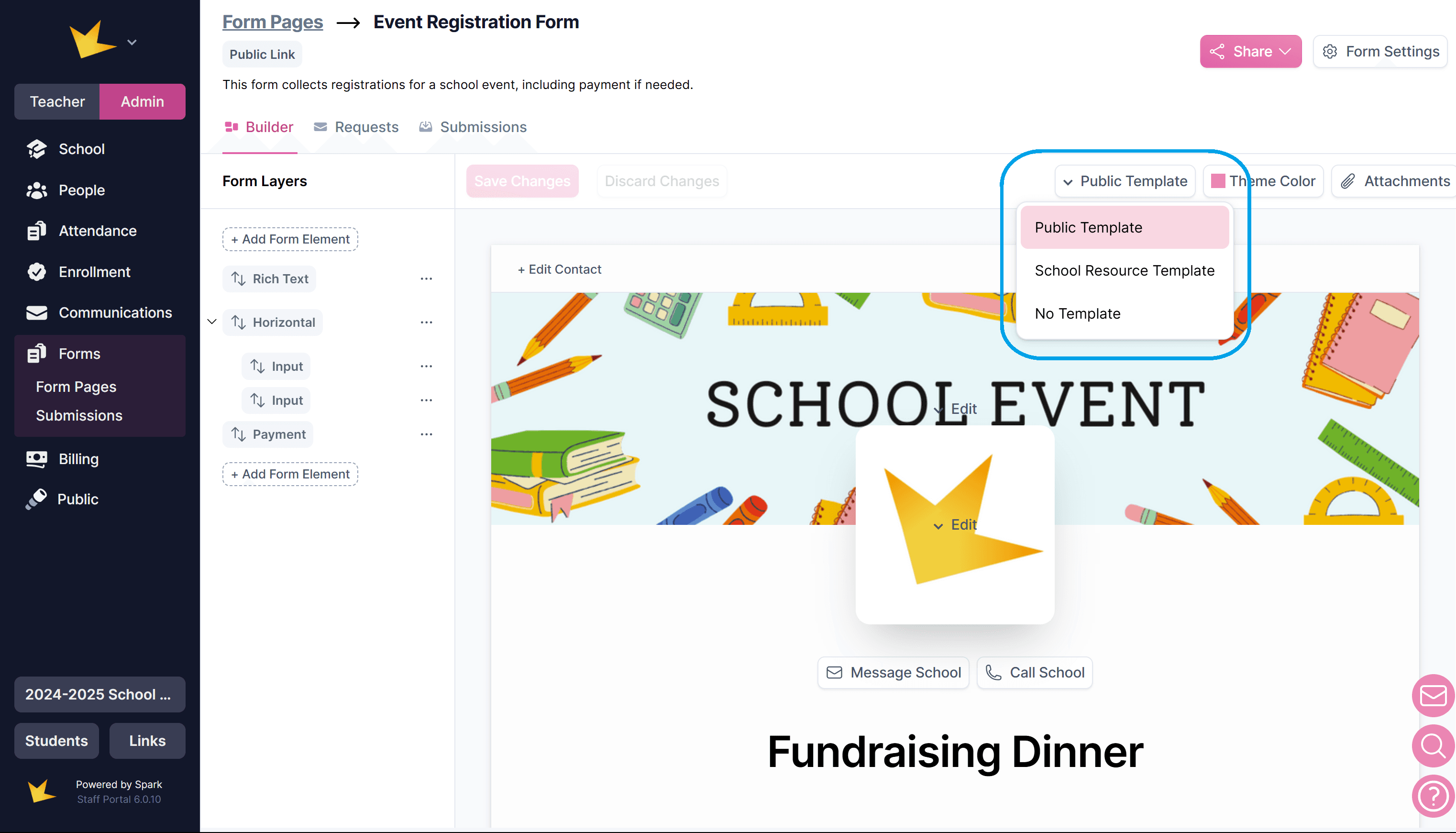
Adding Branding to a Form
You can select different templates for your form to include branding (logo, title, etc.). Simply go to the Builder tab and select the template.
- No Template – No pre-set formatting is applied.
- Public Template – Allows you to add your school’s branding (logo, colors), a banner, and contact buttons for a professional look when sharing forms publicly.
- School Resources Template – Displays your school’s logo, name, and a title, making it ideal for use among those in your school.
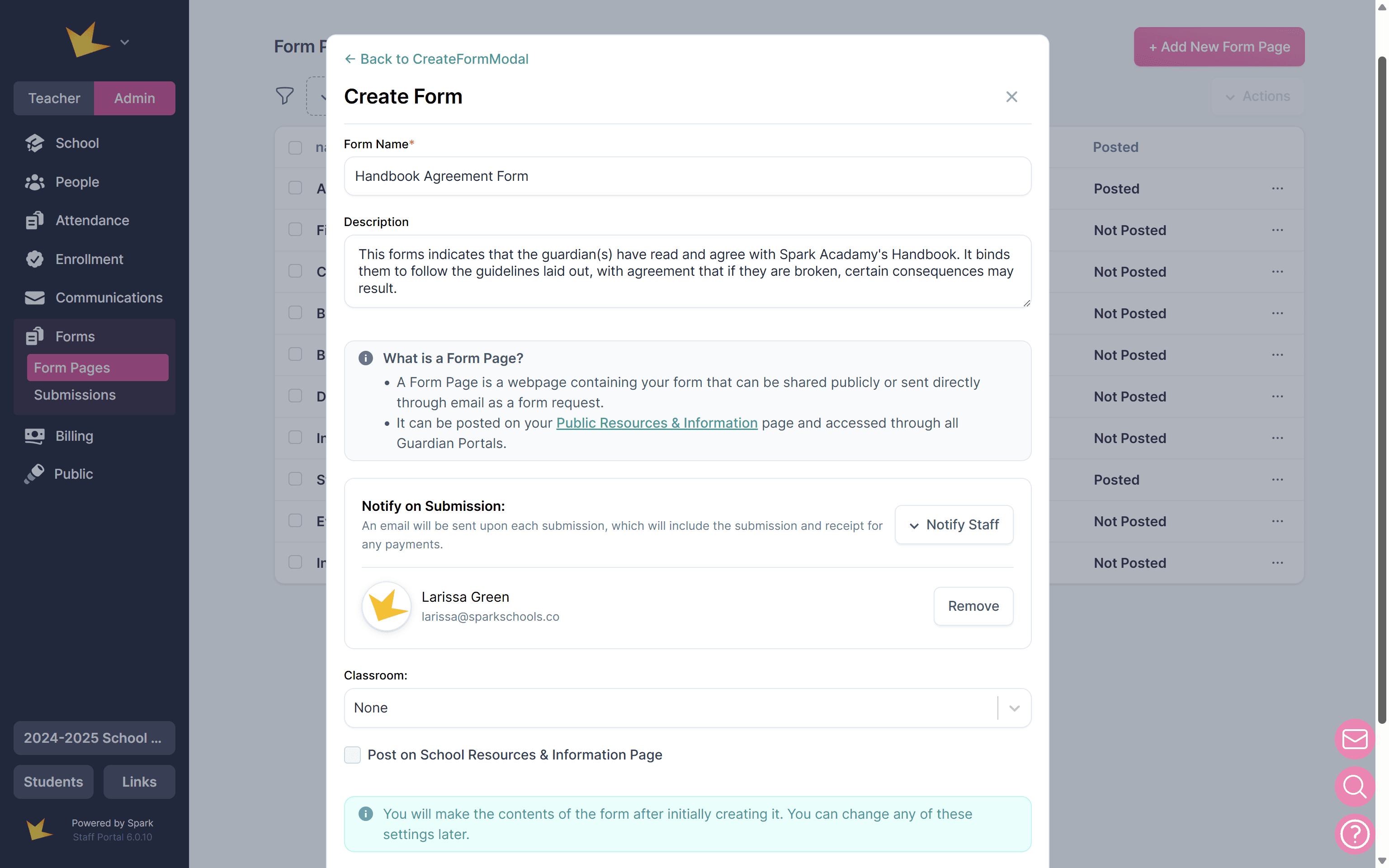
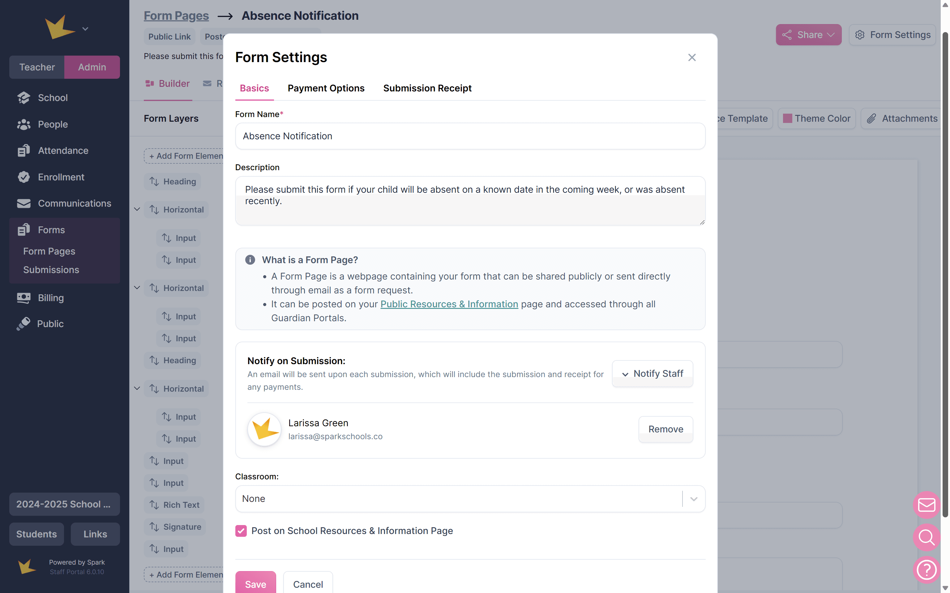
Editing Form Details
- Go to Form Settings to update the form title, description, and other settings.
- For forms with payment elements, adjust payment options and receipts here.
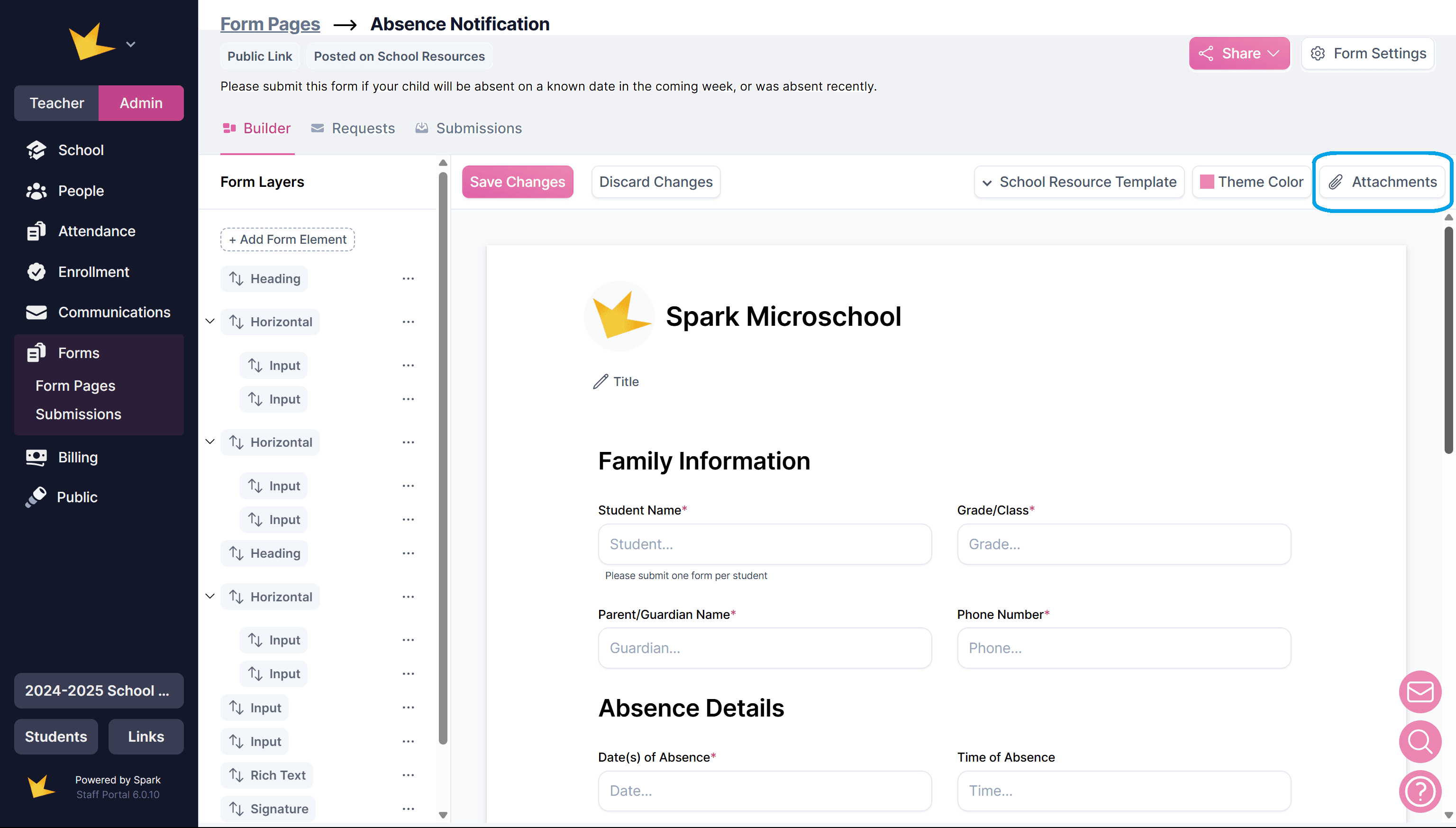
Attaching Documents or Links to Form
- Click the Attachments button in a form to upload files or add links to the form.
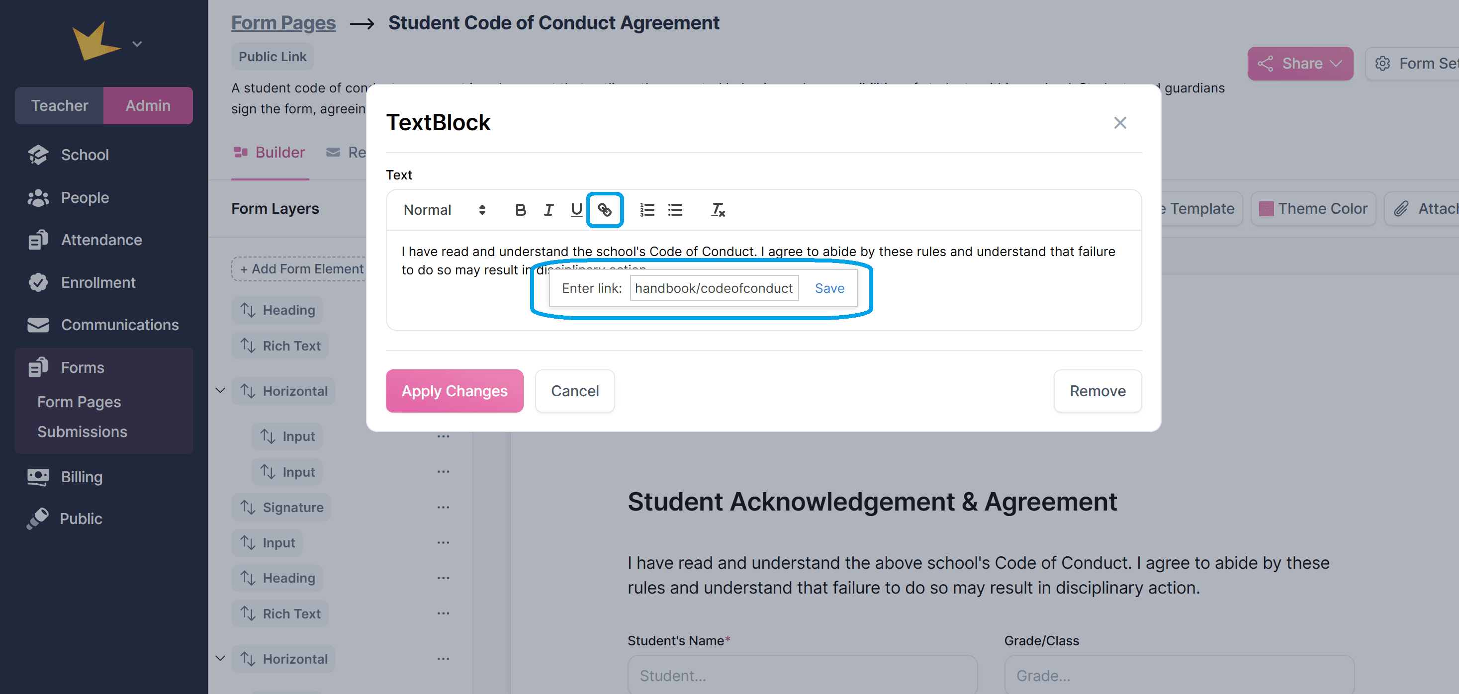
- For links in text, use the Rich Text element and insert the link.
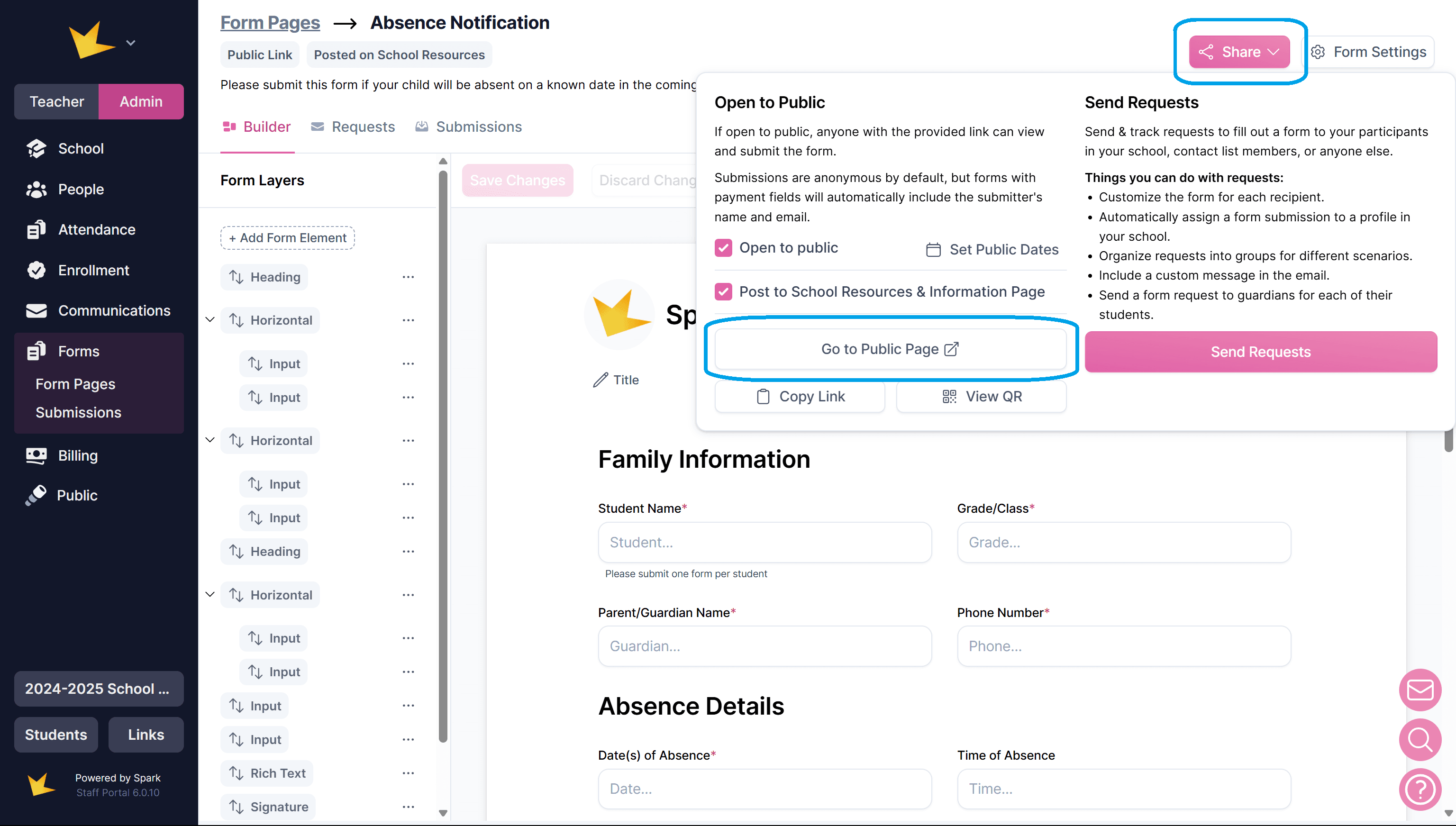
Viewing and Sharing the Form
- Click Share and select Go to Public Page to see how the form will appear to submitters.
- For more information on sharing forms, refer to the "Sharing Form Pages" help doc.
Form Elements
A form element is a field that appears to submitters, such as text inputs, checkboxes, or payment options. These can be customized for your needs.
Types of Form Elements
- Input Elements: Text fields, checkboxes, dropdowns, etc.
- Payment Elements: Enable payments during form submission (requires online payments setup).
- Display Elements: Text-based fields like headings or instructions.
- Layout Elements: Structure the form with horizontal or vertical layouts.
The Inputs "Submitter Name" and "Submitter Email" should be used on a form when payment inputs are also used. These inputs validate the identity of the submitter.
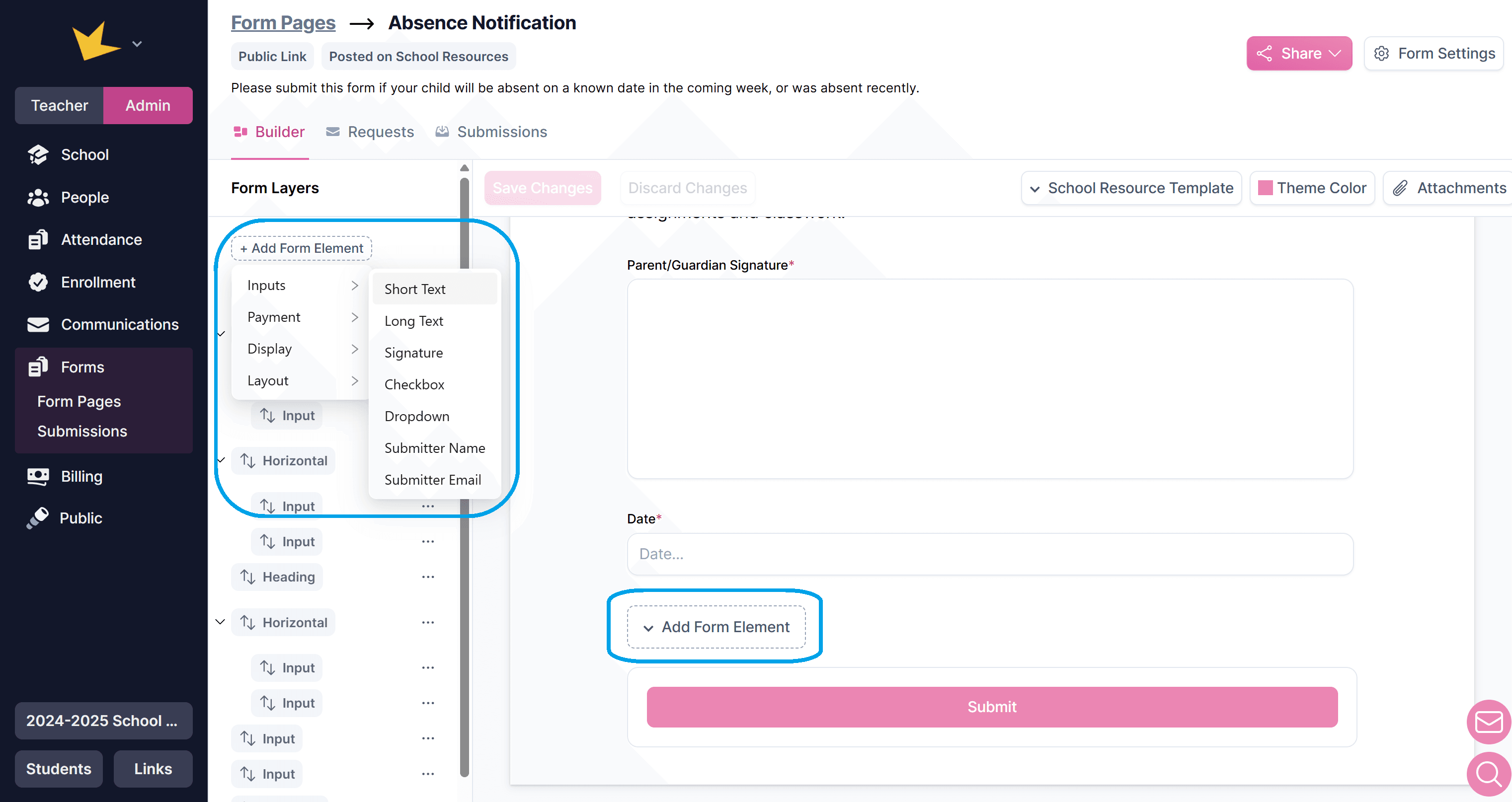
Adding and Removing Elements
- Add: Click Add Form Element in either the Form Layers list (left column) or the Form Preview (main section), and choose the element type.
- Remove: Click the edit icon on the element and select Remove.
Arranging Elements
- Drag and drop elements in the Form Layers section to reorder them.
- Use the Horizontal Layout element to position fields side by side.
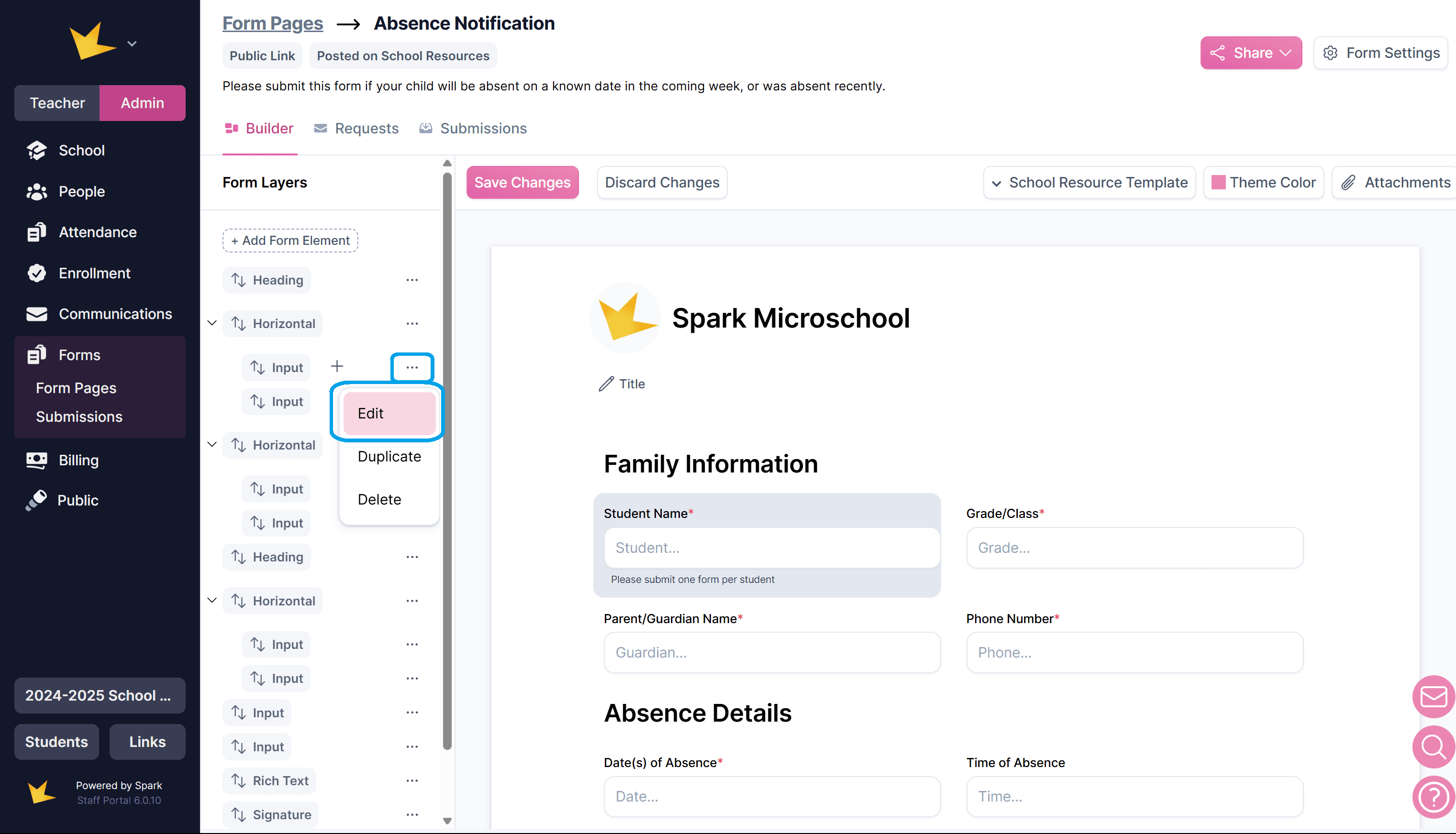
Customizing Elements
To edit an element’s title, add instructions, or make it required, find the element and either click the edit icon, or the three-dot menu next to the element. Elements can be found in
- The Form Layers list (left column).
- The Form Preview (main section).
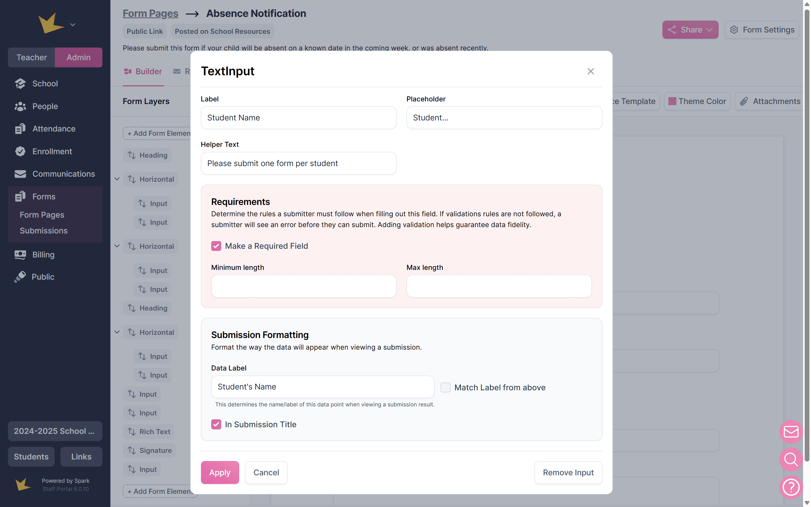
Once in the element, modify settings like the label, instructions, or whether it’s required:
- Requiring Elements: Check the Required Field option to ensure users must fill it out before submitting.
- Adding Instructions: Use Helper Text (for instructions) or Placeholder (example text inside input fields) to guide users.
- "In Submission Title" Checkbox: If checked, the data from this element will appear in the title of the submitted form.
For more information on form elements and how to customize them, see the FAQs below.